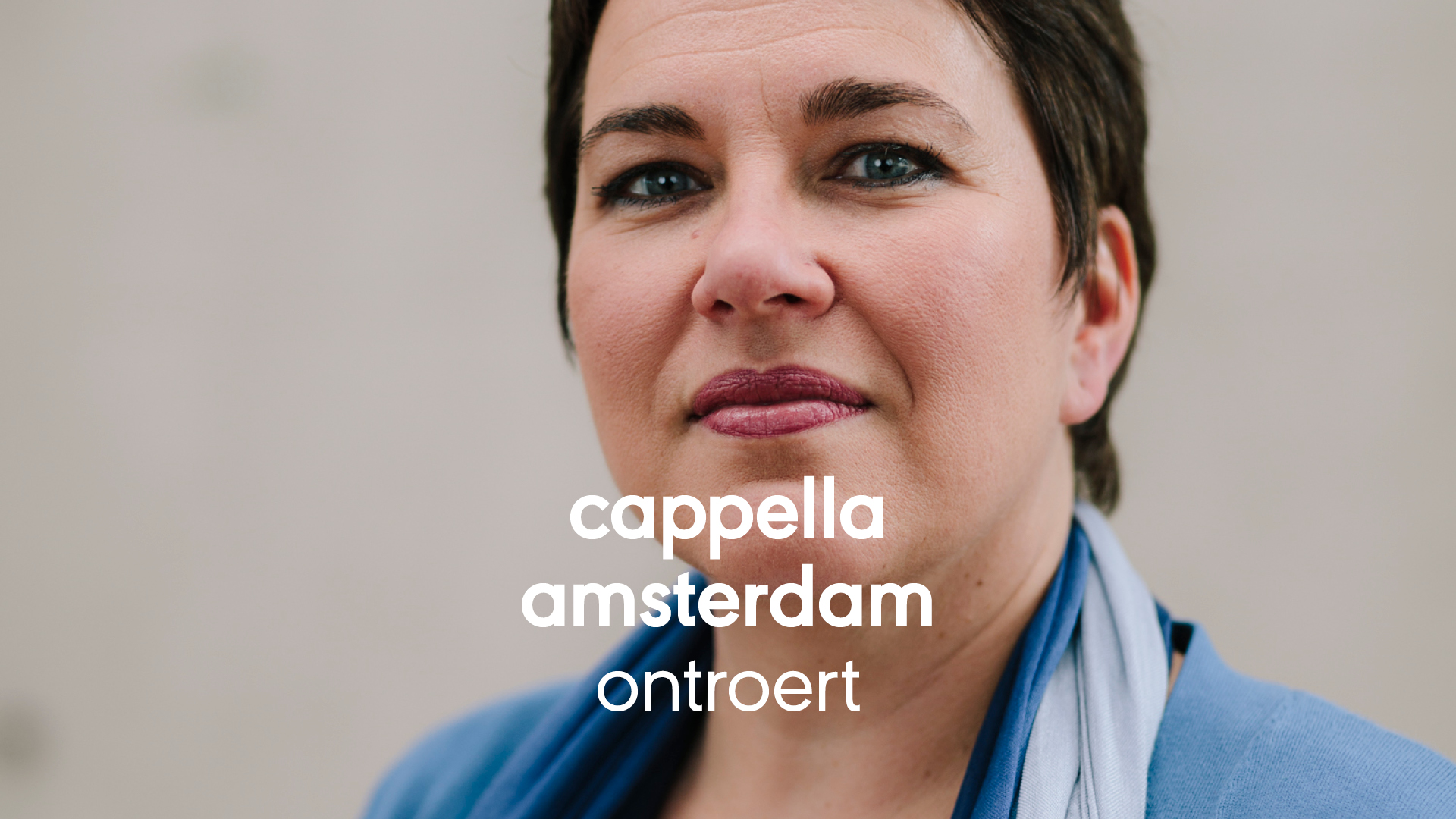
Compositions
of purity and polyphony
The voice is the purest of all music instruments. Cappella Amsterdam is a professional Dutch choir with an international reputation for the excellent quality of their voices and their performances.
Clarity.
From the start.
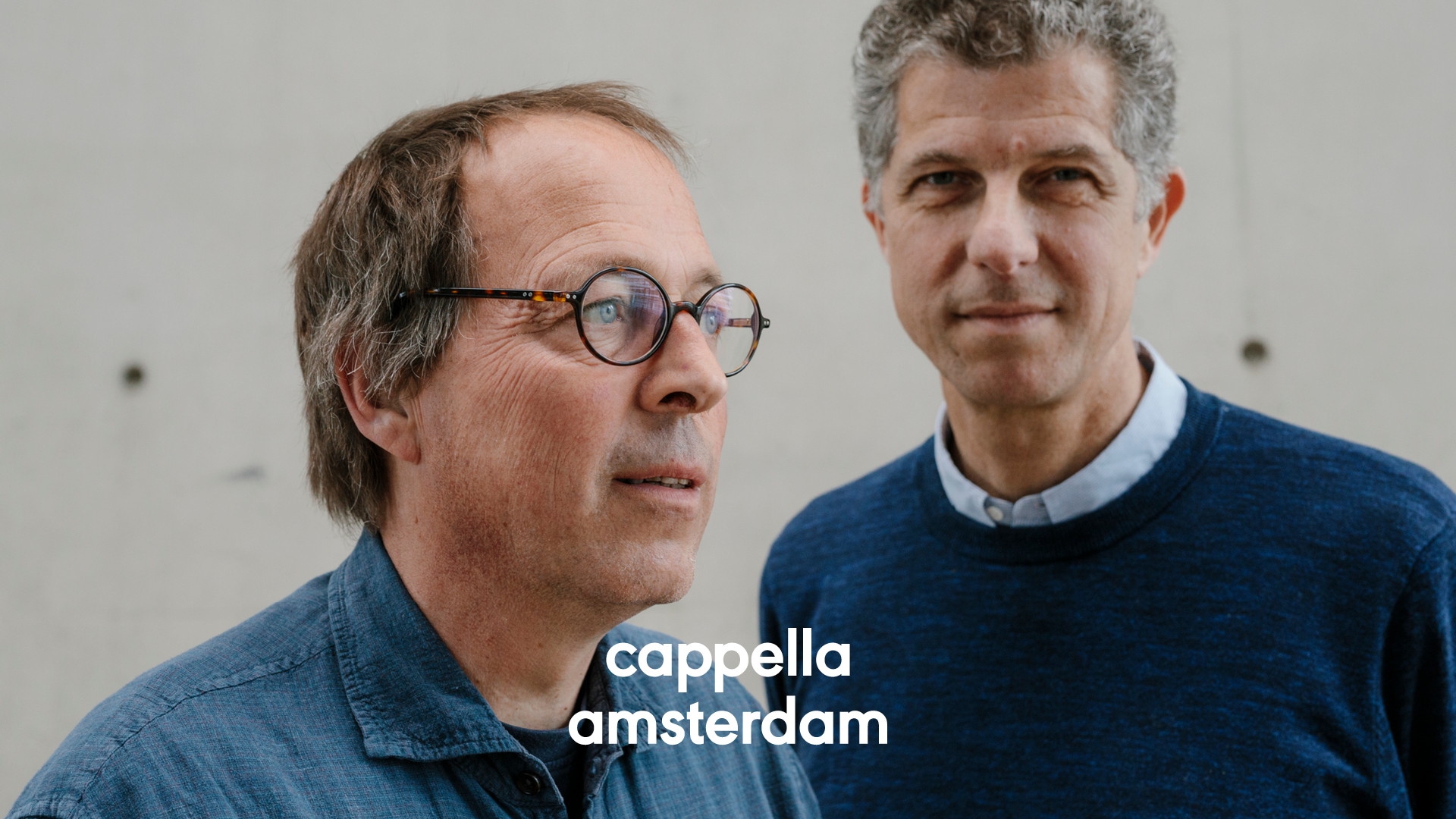
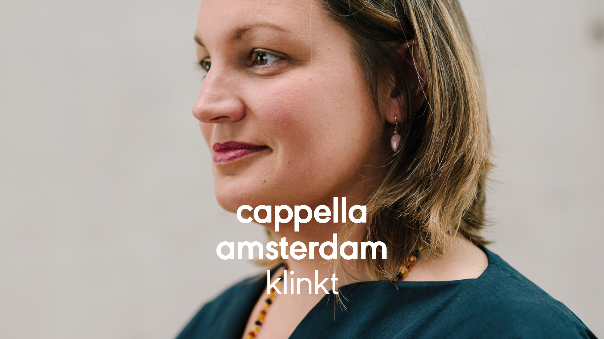
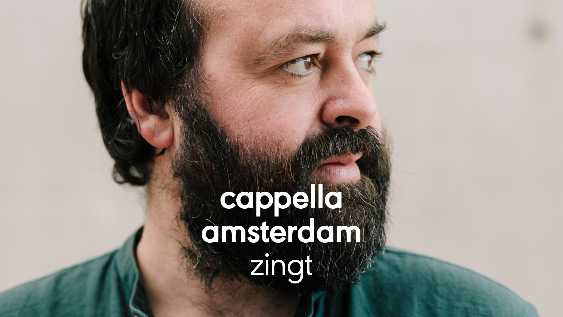
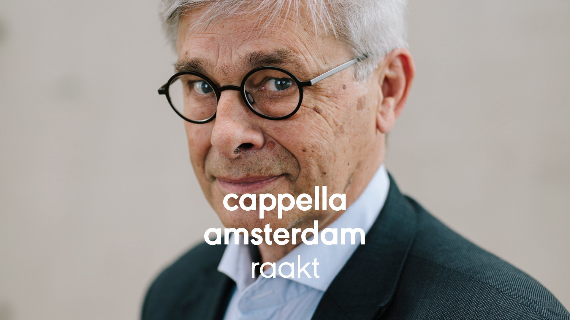
For their new identity we focused on two aspects; the purity and the polyphony of their music. The purity translated into a clear logo type that is combined with keywords to give more values and meaning. The URW Geometric typeface stood at the basis of the new logotype for Cappella.


Aligning sound, image, color and type.
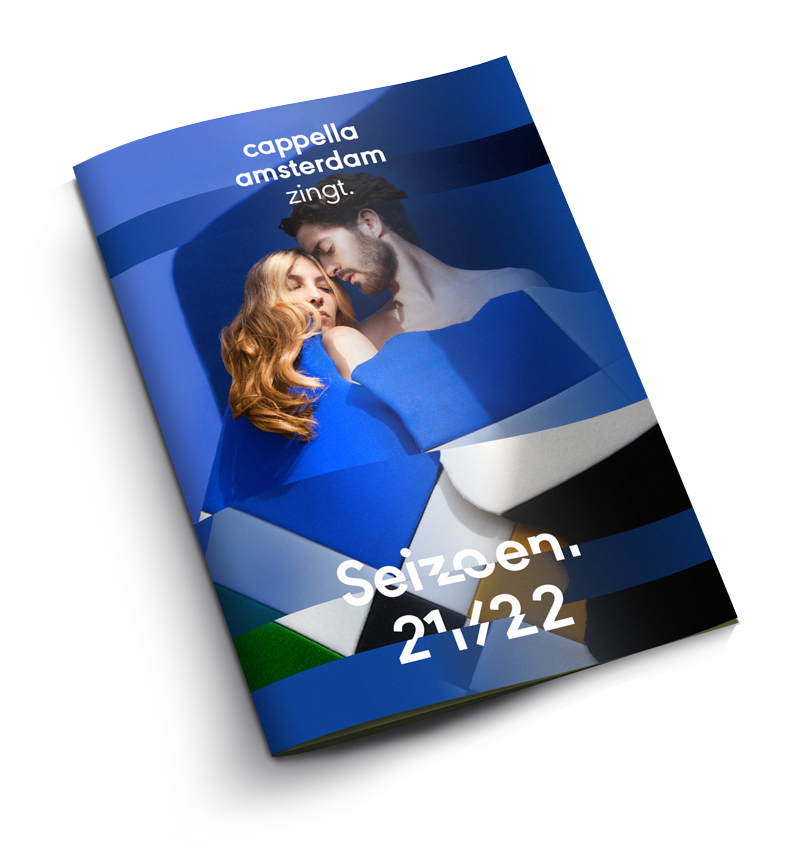
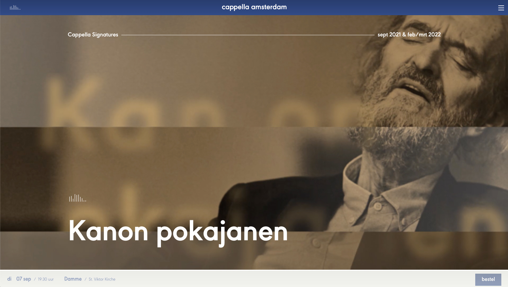
The polyphony is translated in the treatment of imagery and colors; by layering and animate them over time, simple compositions reflect the audio. More voices means more layers, slow animations match adagio vocals and snappy edits fit with more experimental pieces. The logo type and image treatment combined, form the base of the identity.

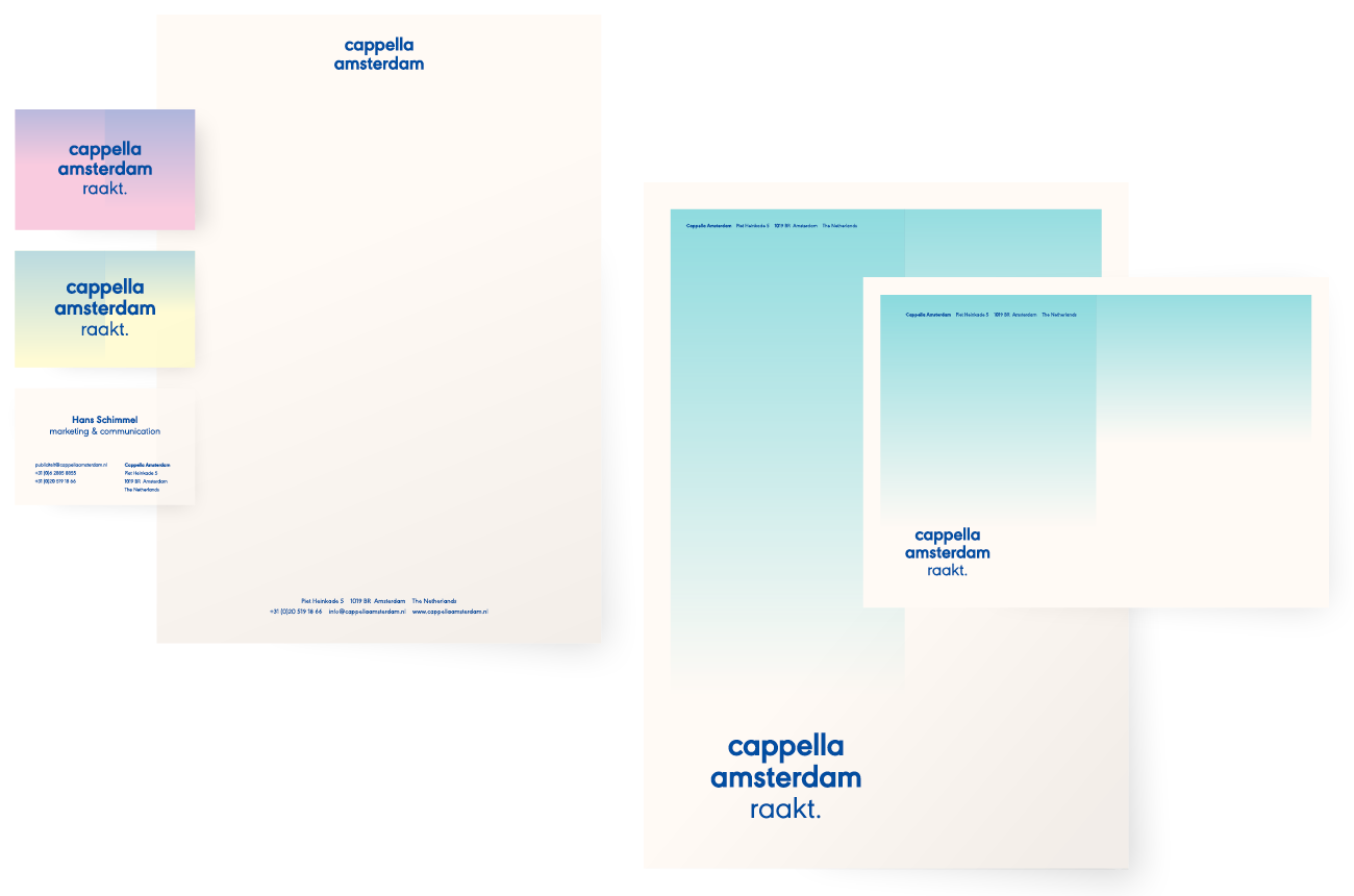


“We were facing the challenge of redefining our vision, mission and visual identity. Ape to Zebra turned out to be a fantastic partner to help us with this task. They empathize with what you want to achieve as a team and organization. Also, the guys really make sure to get the job done quickly and are truly service-oriented as well. Together we came up with a new visual identity that is not only to the point, but thought out as well.”
— Bas Drooge, Business Leader Cappella Amsterdam
Here we are
Ape to Zebra

