

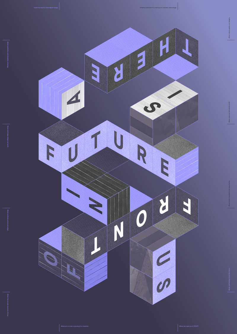
There’s a
future in
front of us
— Client
FRONT® Materials
— Services
Strategy
Branding
Campaigns
Webdesign
Print
Video
— Website
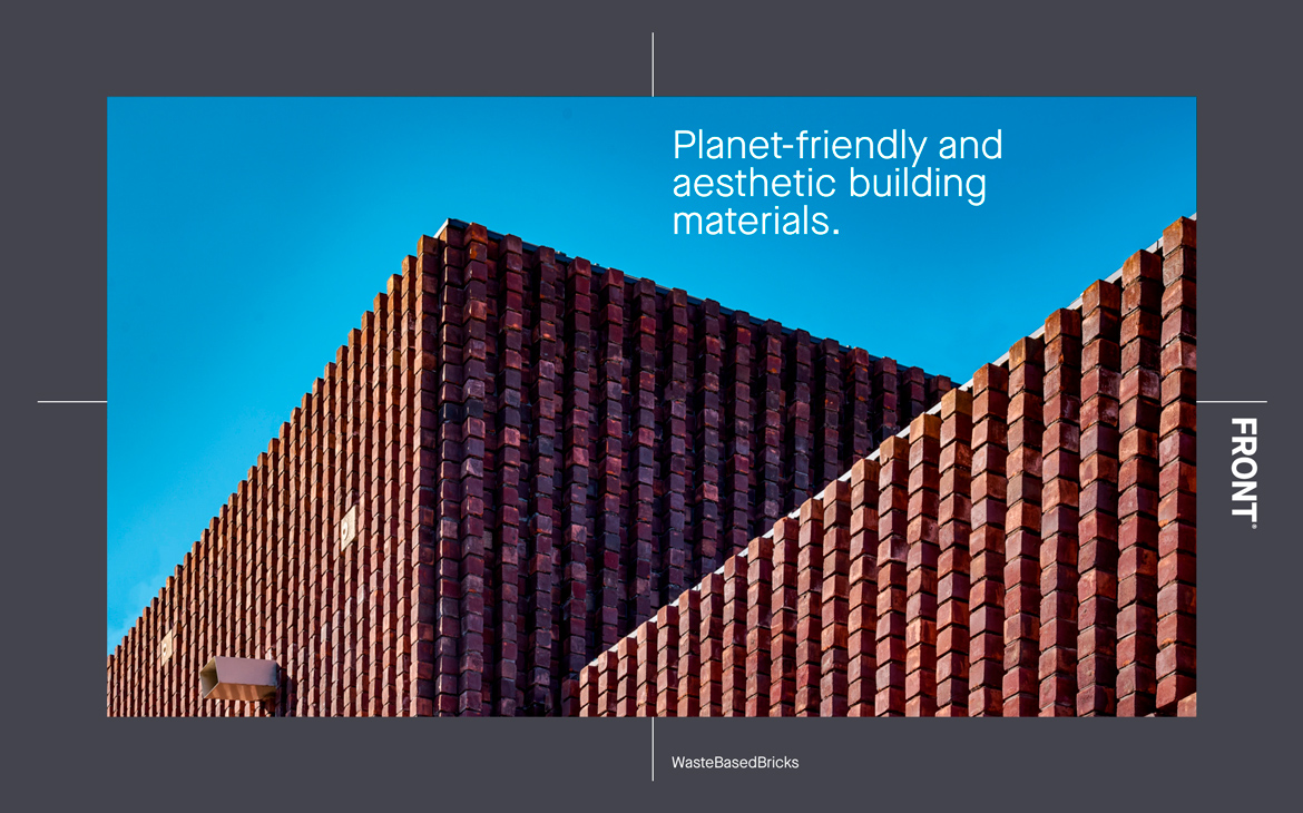
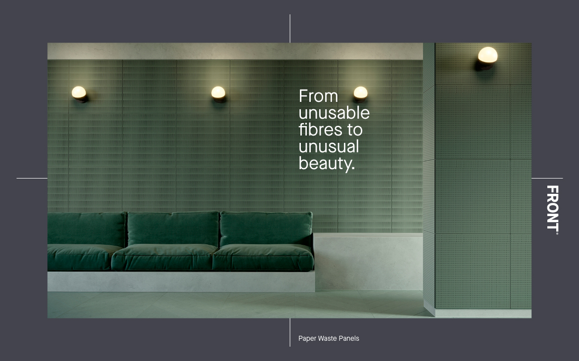
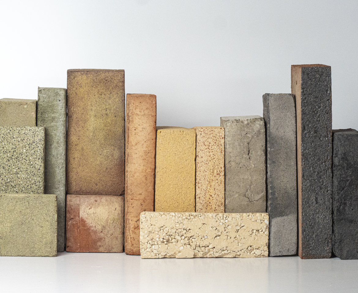
Imagine a circular world where waste is synonymous with raw material. Where cities and their buildings will be constructed of sustainable building materials that are made from 100% waste, are 100% recyclable at the end of their life cycle, and absorb more carbon than it takes to create them.
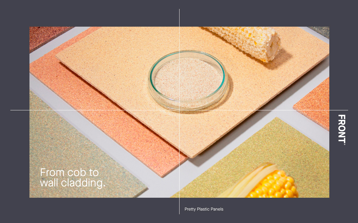
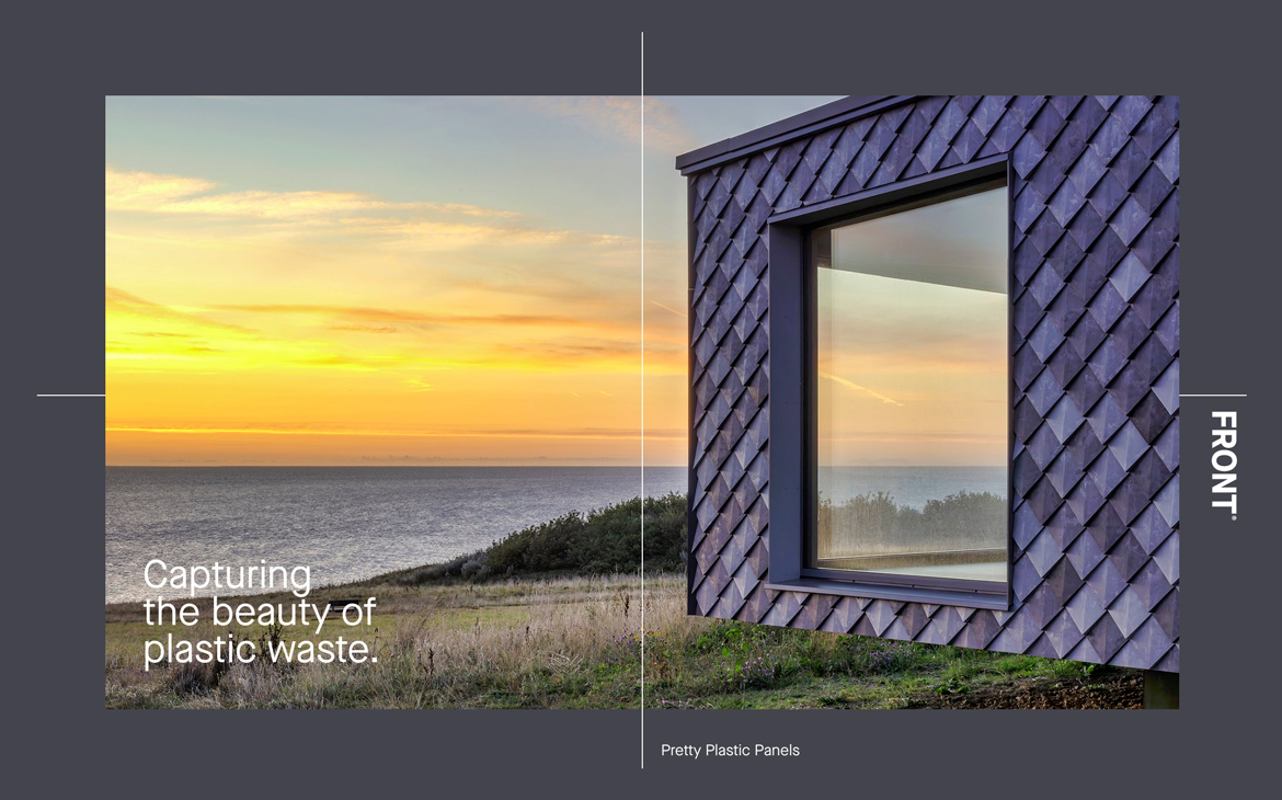
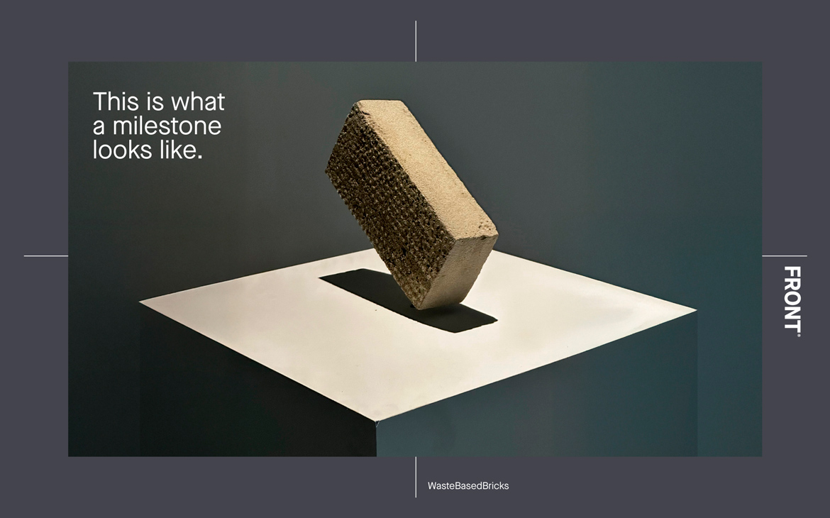
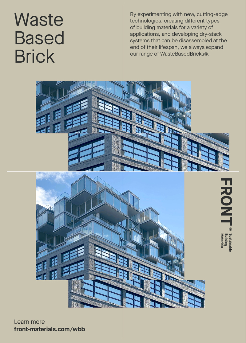
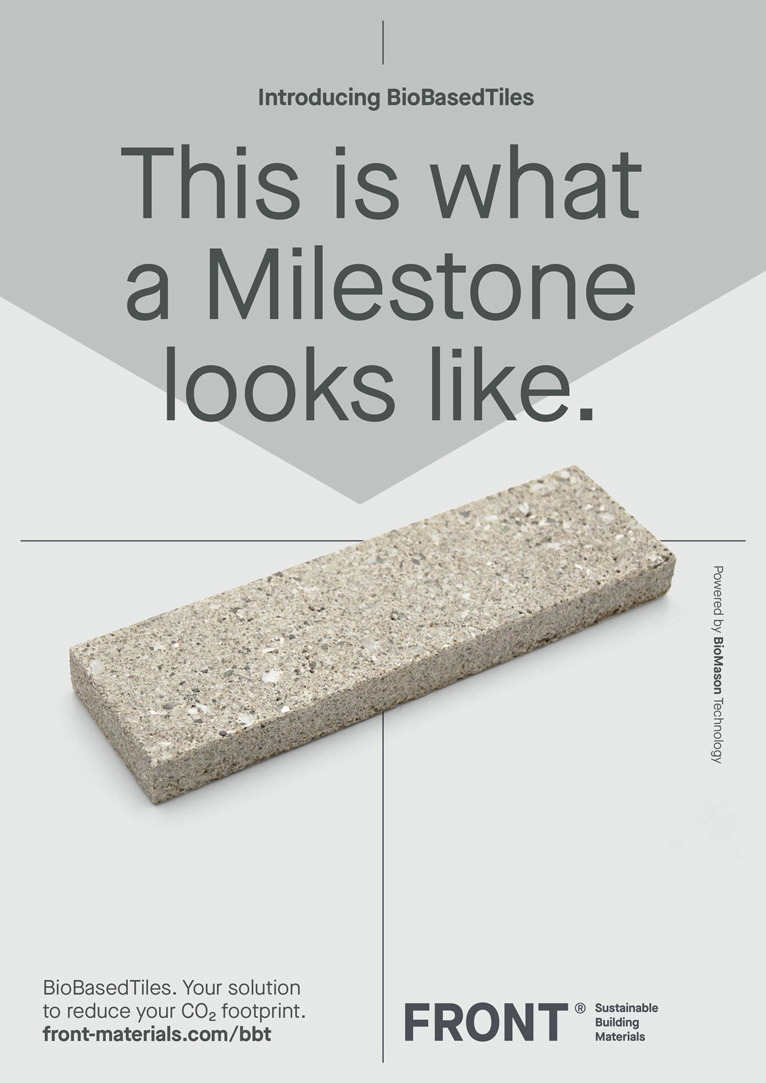
FRONT Materials (formerly StoneCycling) is a leading innovator in the field of sustainable building materials. The company specializes in sustainable, aesthetically pleasing materials for the construction industry, with a focus on advancing the circular economy. With a portfolio that includes the internationally recognized WasteBasedBricks®, FRONT Materials is committed to creating a more sustainable and beautiful built environment.
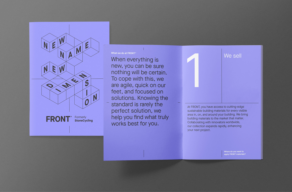
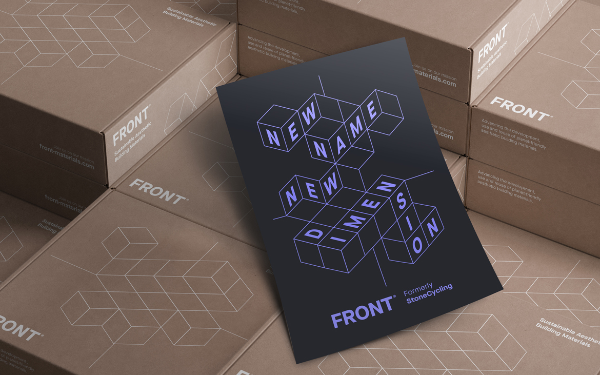
New name, New dimension.
The decision to rebrand StoneCycling comes as the company expands its vision and scope. The new name, FRONT Materials, reflects its commitment to pushing the boundaries of sustainable material design and production. More than just recycling, FRONT is redefining the future of construction with materials that are both groundbreaking and responsible.
As FRONT Matrials, the company remains dedicated to sustainability while accelerating the development of innovative materials and technologies that further reduce environmental impact. This rebrand marks the next chapter in its evolution, positioning FRONT to take on more ambitious projects and collaborate with architects, designers, and builders who share a vision for a greener, more sustainable future.
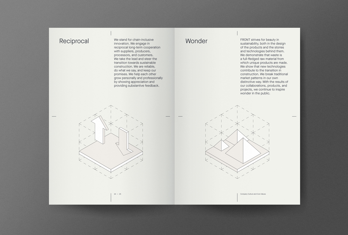
Evolving heritage
The new identity needed to reinforce the company’s new direction and name. At the same time, given its strong reputation in the industry, it was essential to maintain a link to the past. Instead of a radical shift, the brand evolved—subtly referencing its heritage while embracing a bold, revolutionary edge.
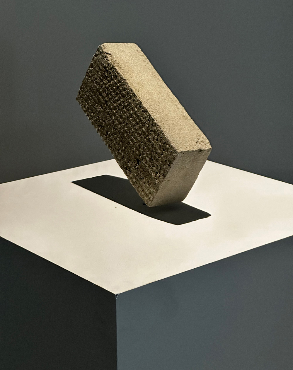
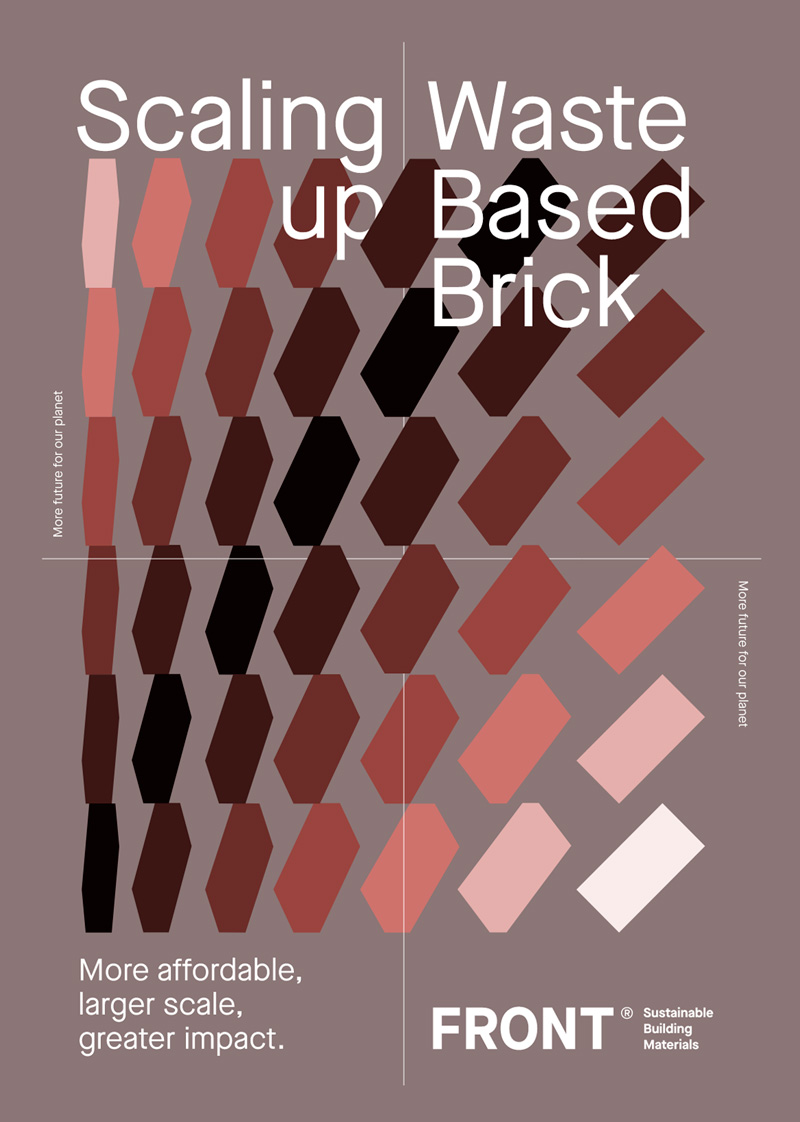
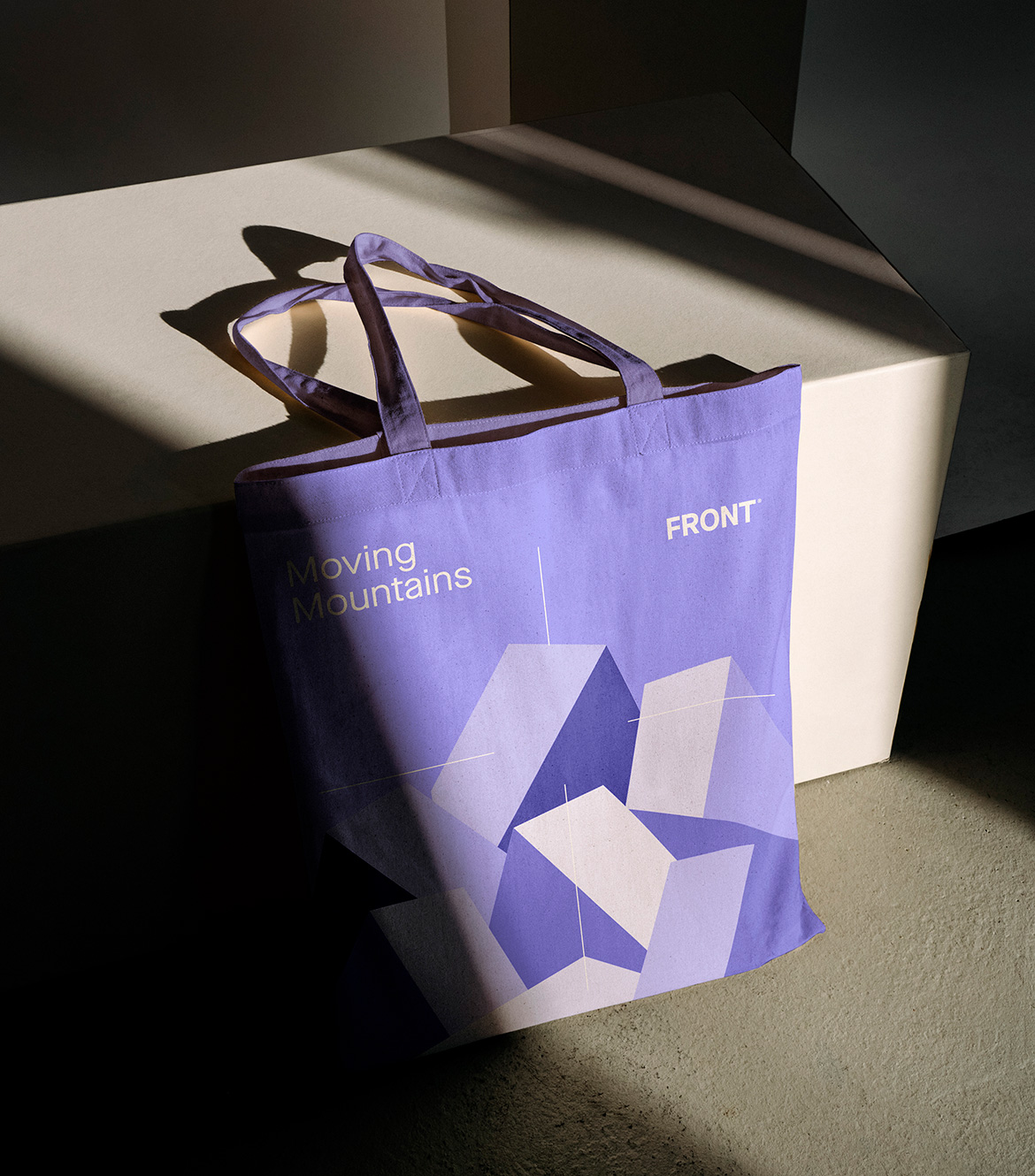
The isometric brick from the old identity became the foundation for a dynamic grid of blocks. This flexible system forms the backbone of the new visual language, creating a fresh yet recognizable aesthetic. By layering text, photography, textures, colors, and iconography, the design gains depth and versatility, shaping a rich and distinctive brand experience.
Typography
To maintain brand recognition and visual harmony, we retained Maison Neue—the signature typeface from the previous identity. By subtly redefining typographic hierarchy and introducing a coordinate-based system, we crafted a new, distinctive typographic language that pays homage to the past while embracing the future. This approach ensures that the typography remains both functional and evocative,


“Working with Ape to Zebra on our brand identity was exceptional. They delivered a striking visual narrative, from a powerful brand video to typography inspired by our technology. Their creativity embodied our values of exploration and ingenuity, exceeding expectations. Highly recommended for innovative visual storytelling.”
— Ward Massa, founder Front Materials
— Website
— Development
Here we are
Ape to Zebra