

An identity for diversity

The mbo (Secondary vocational education) is in transition; mbo’ers are also called students nowadays, new initiatives are helping students to follow up on their education and now there is www.kiesmbo.nl. This platform, that was launched by the minister of Education, gives the future mbo-students more overview and grip on the complicated proces of choosing their educational and professional future.
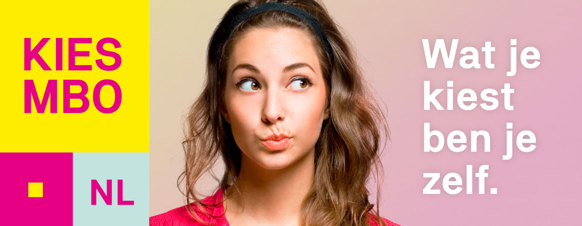
An inviting and inspiring identity
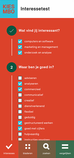
Because the platform offers more than 400 courses, there had to be a strong focus on user-friendliness. Students should be immediately invited by the design to actively start their search for their future education. In addition to a clear and intuitive interface the design had to take students by the hand, stimulate and inspire them.
Concept
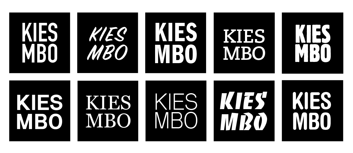
The basis for the identity of KiesMBO.nl exists of the square with KIES and MBO. The name can be written in different fonts and the square can be any colour imaginable, as long as the combination has enough contrast. This is to emphasize variety and richness in the world of MBO. Visually creating more coherency through diversity.


“We are getting nothing but compliments. Ape to Zebra really understood the role of our users and created a recognizable and unique identity.”
— Dagmar Brandt, MBO Raad
— Odile Sondermeijer, S-BB
— Development
Here we are
Ape to Zebra