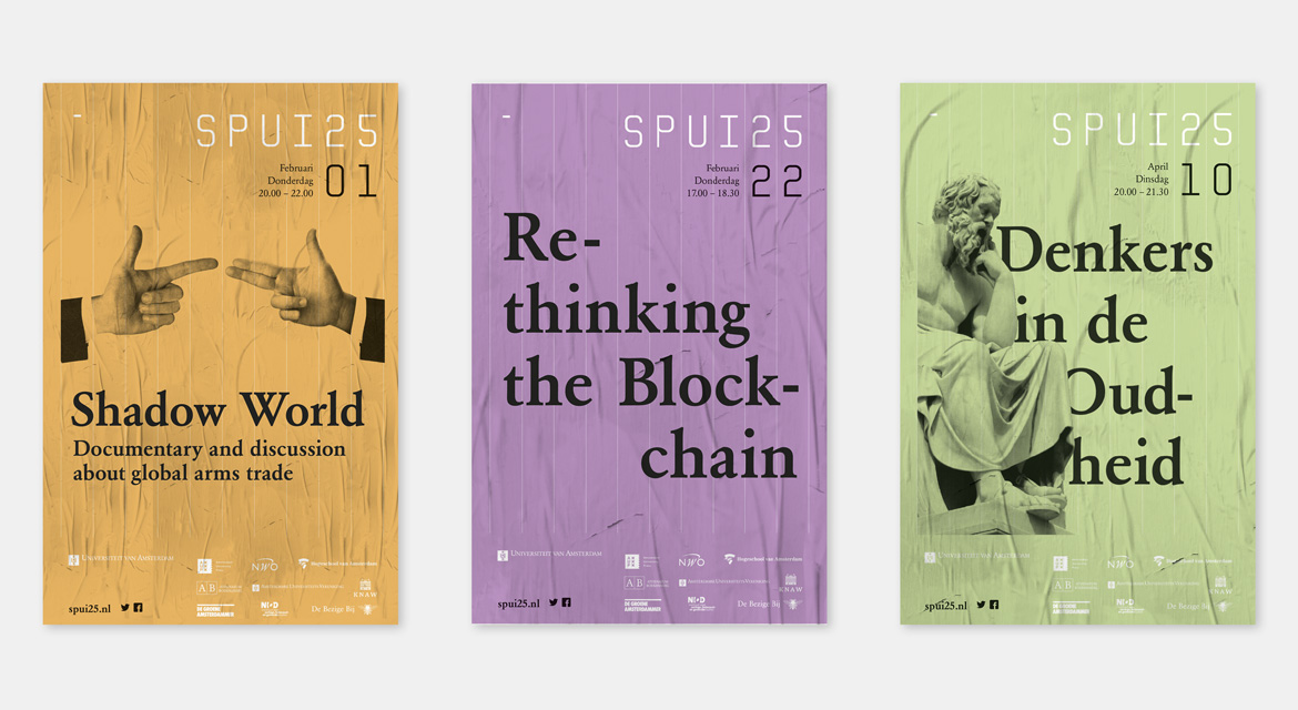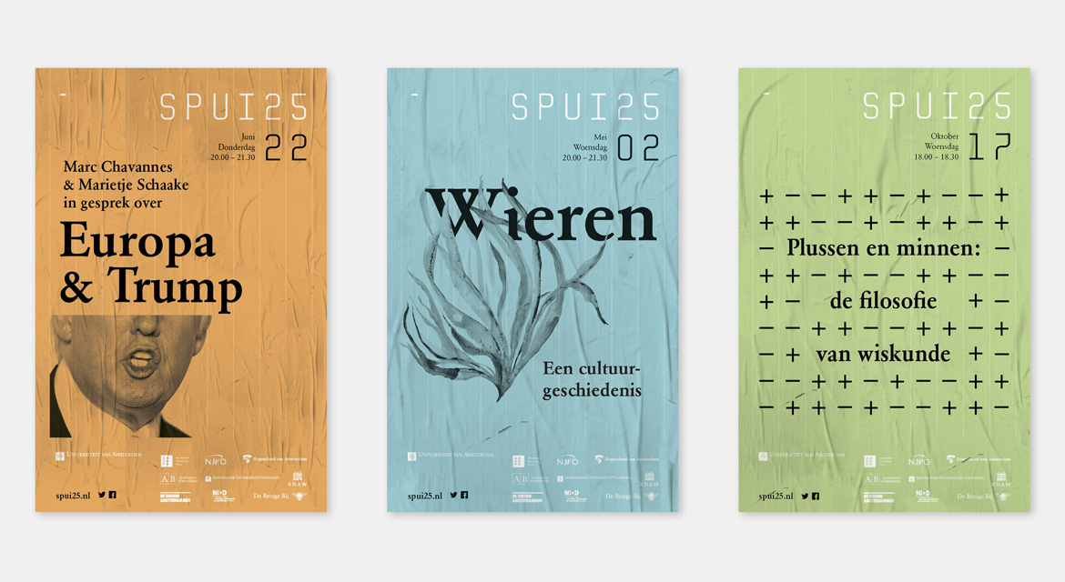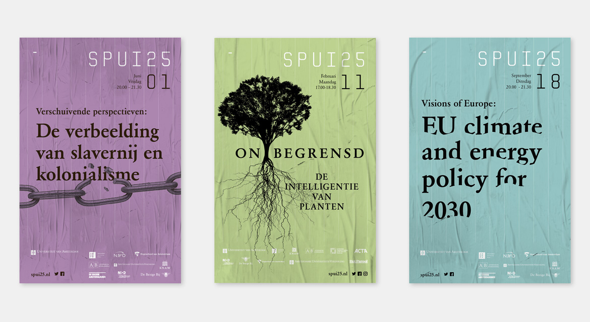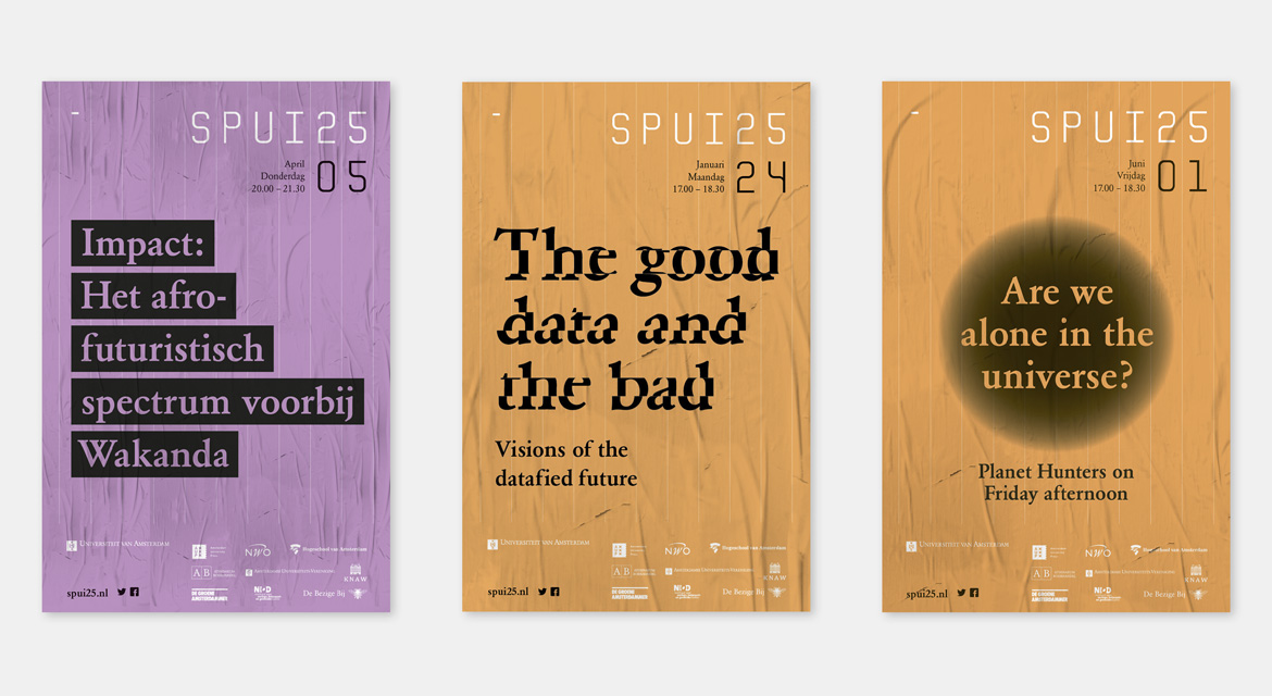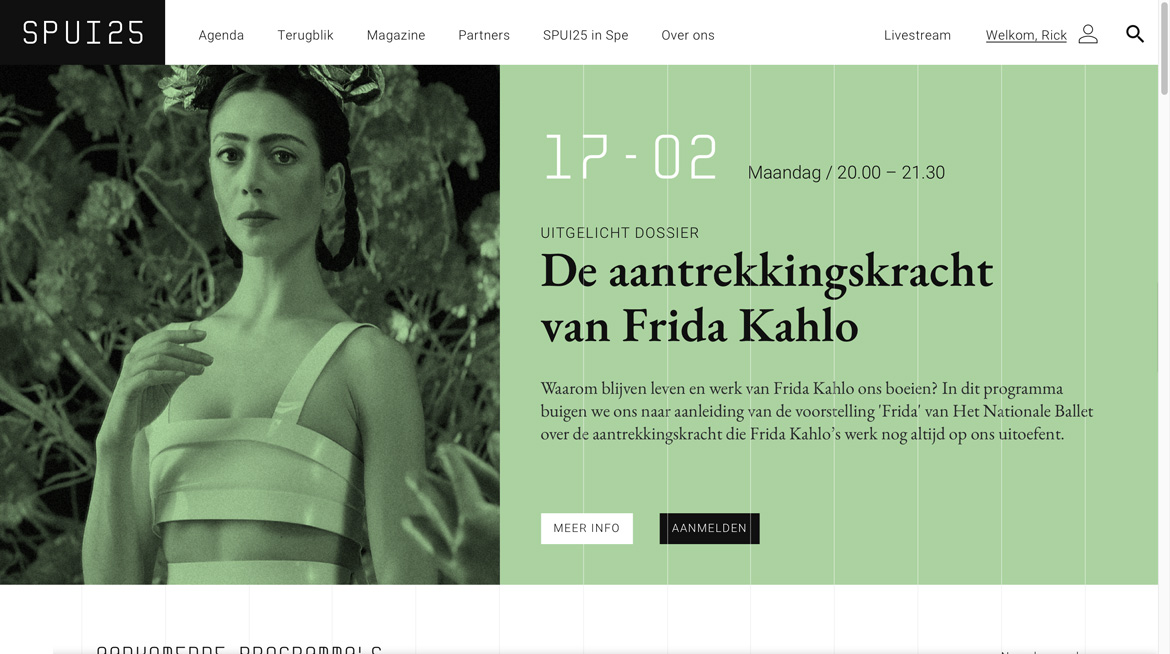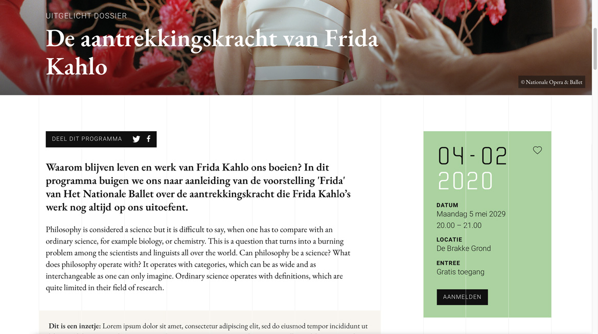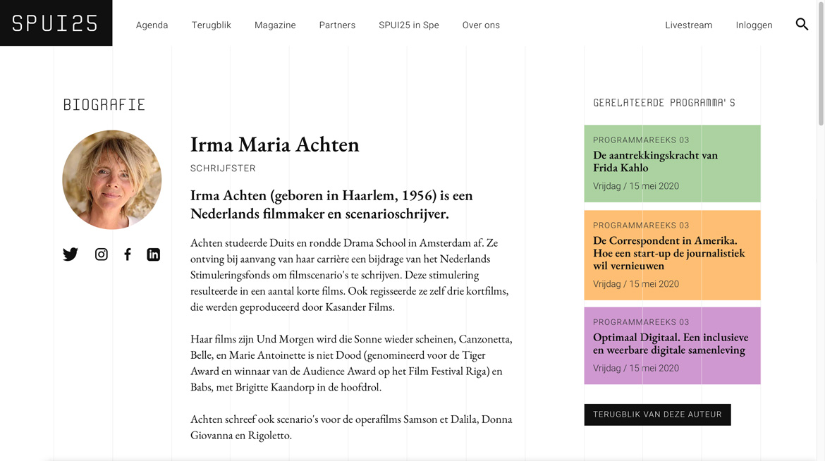
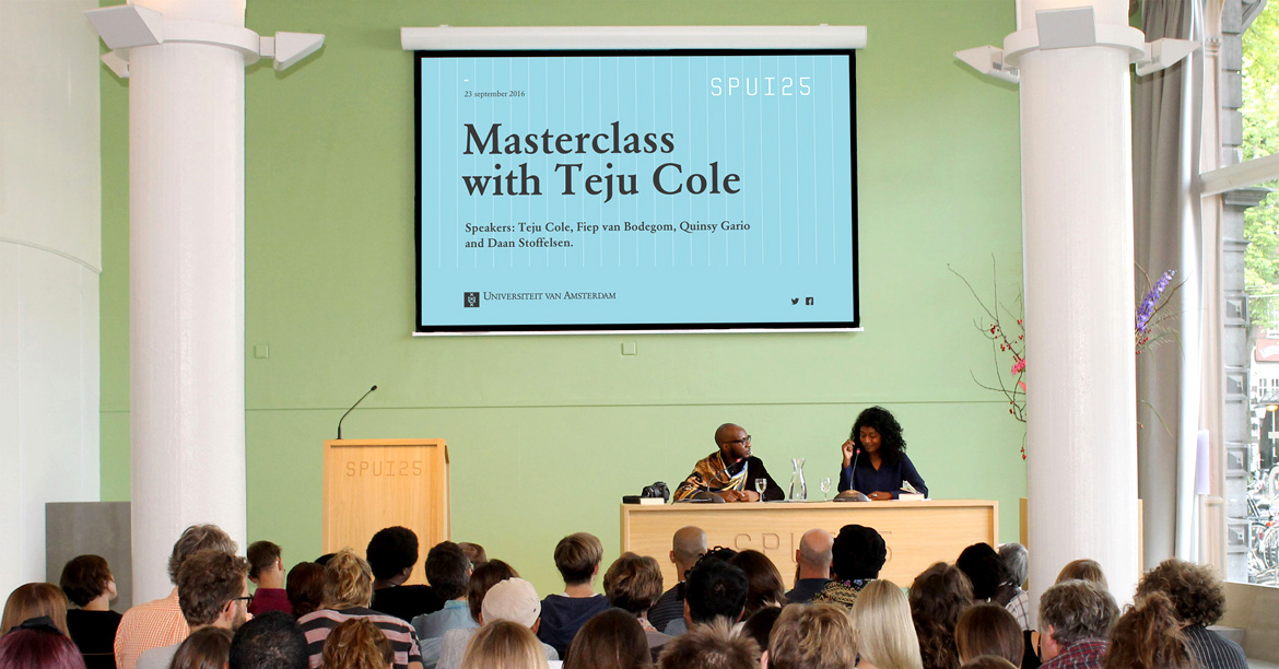
As a vibrant forum SPUI25 connects the academic world with the cultural sector in the broadest sense, as its events oscillate between science and imagination, fact and fiction. Almost daily, academics, writers, journalists, critics and creatives take the stage to discuss new findings in science and culture.
A suiting identity to match the objectives
A while ago SPUI25 underwent a major refurbishment. They took the opportunity to thoroughly look at their visual identity as well, because it no longer matched the objectives of the institute. The visibility had to be increased, more target groups had to be addressed and there was a desire to increase their social role at the center of the city.

Radiating actuality and urgency
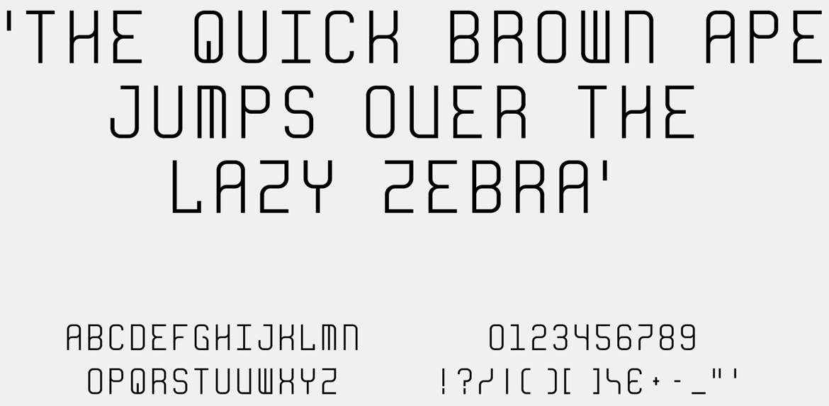
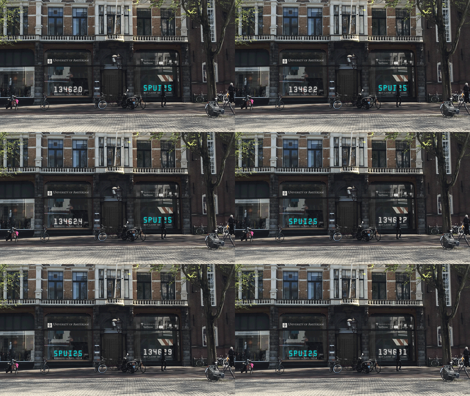
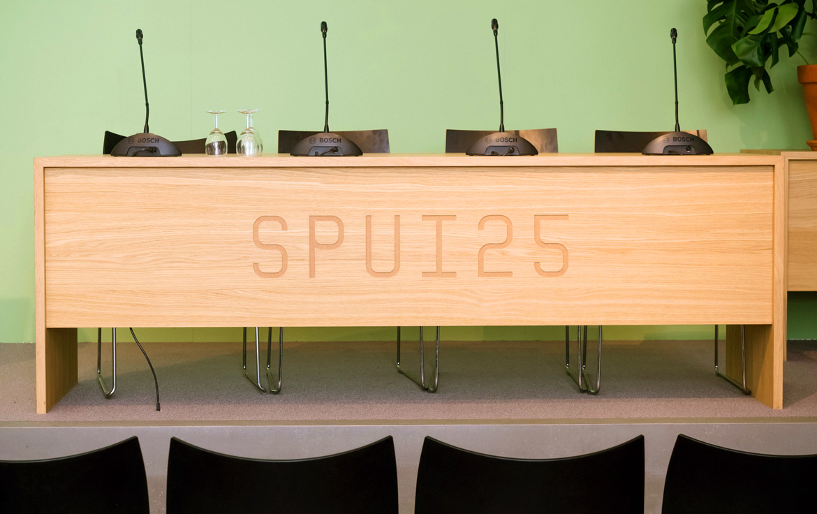
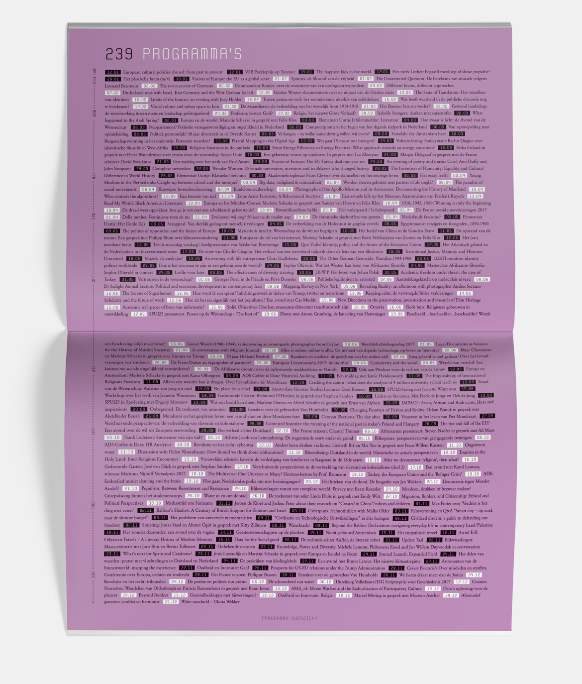
To us, this meant that their new appearance and behaviour should radiate actuality and urgency. These characteristics manifest themselves best in a clock. Therefore, the letter forms of the logo are derived from the technical framework of a digital clock. We developed a font, finetuned by type designer Edgar Walthert, and made it suitable for print. This font forms the core of all corporate communications of SPUI25.

— Development
— Typography
Here we are
Ape to Zebra
